A Few of Our Favorite Things: 2019 Design Trends
05/01/2019One very important aspect of being a graphic designer is to evolve, infuse new design trends and make sure to keep our designs fresh without falling into the pitfalls of running with the crowd on whatever is new and shiny.
2018 brought many great styles into the playing field; some of my favorites were “ruined” or grungy effects, double exposure, and gradients! But will these styles stand the test of time or will they fade back into obscurity? I’m very excited to see what 2019 holds as tried and true, as opposed to what emerges as new and fresh to steal the limelight for a while.
Now that we’re a few months into 2019, I wanted to share a handful of my favorite design trends so far (in no particular order):
Open Composition
Hooray to the end of boxes! Okay, probably not the end, but I rejoice at the decline of constricting text and photos into frames or boxes. I absolutely adore full bleed layouts that give the viewer the impression of expansion beyond the trim of the pages. Plus, the connection between imagery and text is intensified when the type can sit directly on the negative space of an image versus excluding it by putting a boring white box behind it.
Design by John Thornton
Designer unknown 
Design by indesignskills
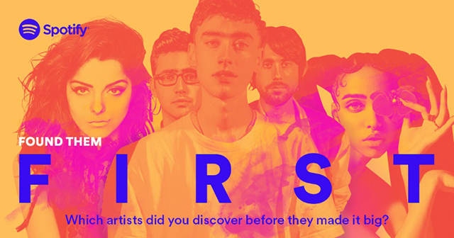
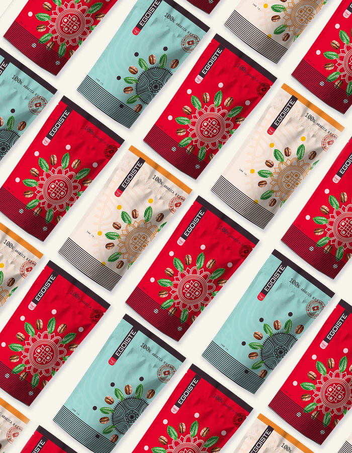
Duotone and Gradients
Two of my favorite styles combined to make the perfect match. Gradients were on the up and up last year, but this year designers are taking it to the next level. Instead of just using the gradients as a subtle background or reclused element, designers are using them as a key point of their design. Throwing duotones into the mix is like putting the cherry on top.
Duotones by themselves are eye-catching yet minimalistic, bold, and quirky all at once. They have a lot of personality and can also be used to freshen up older images with dull or lack-luster qualities. Spotify’s newer brand identity includes a series of duotones which helped further this trend.
Design by Julia 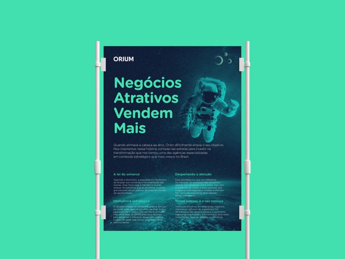
Design by Murilo Pinto Pereira
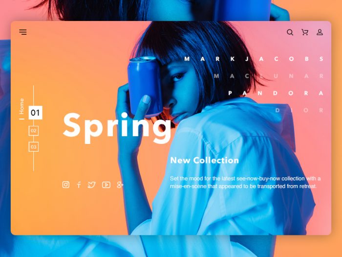
Realism + Flat Elements
We’ve all heard the phrase “Opposites attract” and that’s precisely why designers have been drawn to this style of combining photo realism with quirky shapes, textures, patterns—really anything that’s unexpected! This trend is sure to turn heads, because of it unexpected juxtaposition.
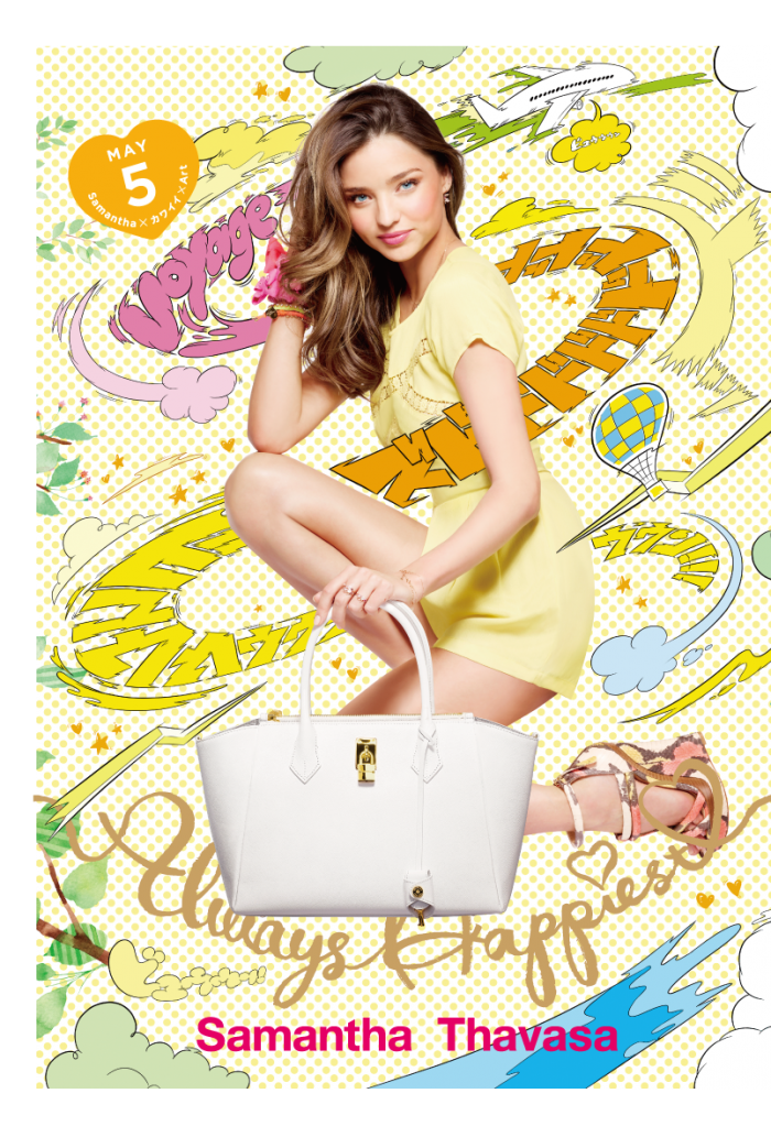
Design by Samantha Thavasa 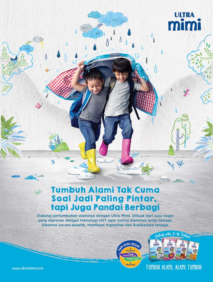
Design by Ultra Mimi
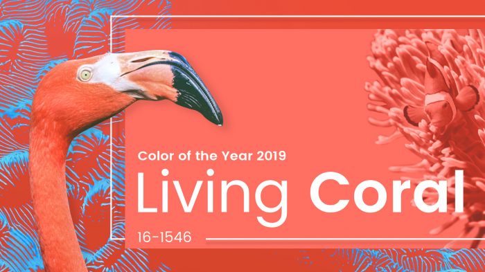
Honorable mention: Living Coral
I had to throw this last one in because I absolutely love this color. Living coral is the color of the year for 2019, and it is an energetic hue of coral with a golden undertone—Definitely a left turn from the luxurious Ultra Violet of 2018. I can’t wait to see where this fantastic color will turn up!
Sources: https://graphicmama.com/blog/graphic-design-trends-2019/ | https://99designs.com/blog/trends/graphic-design-trends-2019/#illustrations
– – –
Kaylee Wolff
Posted in: A Few of Our Favorite Things | Design
Tagged: 2019 | A few of our favorite things | Composure | design trends | duotone | flat | gradient | Kaylee Wolff | open composition | Pantone