Inspiration Destination: MAM Art In Bloom
04/18/2019Art In Bloom has become somewhat of a Composure tradition. Every spring floral arrangements are created to reflect a particular piece of art displayed at the Milwaukee Art Museum. Over the years, we’ve seen multiple floral interpretations of some of the same art.
It was terribly difficult to decide which pieces I wanted to share. All of them had something that made me to walk away thinking, “that was clever”, recognizing the heart that goes into each interpretation. While I was at the museum I had my favorites, or so I thought, but when I sat down and carefully reviewed the photos I took, the little surprises of color and fine details led to these final choices.
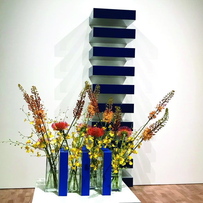
MKE Candle Company created this piece inspired by Donald Judd’s Untitled. I imagine it was quite difficult to approach this piece as a floral arrangement. I don’t feel that there was much done to use flowers to mimic the art. It almost feels like cheating. The blue blocks between the flowers is the only real sense of the art and the flowers are just a bonus. While I don’t particularly feel this was the best interpretation, I picked this piece simply because I liked it. I love geometric shapes mixed with organic and I also appreciated the color palette it created.
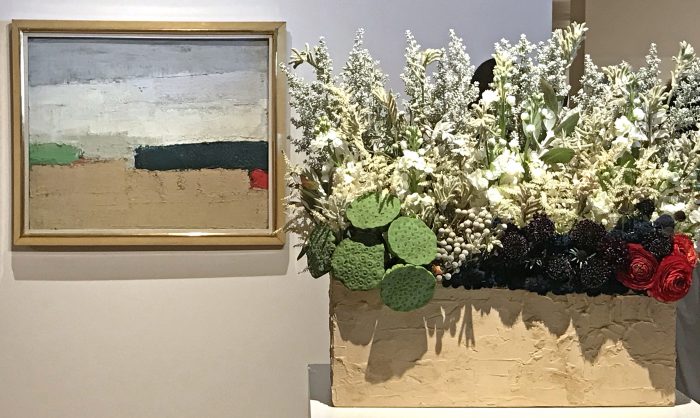
Shady Lane Greenhouses were inspired by Nicolas De Stael’s Landscape. This was my top choice. I am a fan of abstract artwork with layers of paint and shapes that create unique edges with tiny surprises. From the planter to the floral choices, this was a perfect rendition in floral form. The texture and color are nearly a perfect replica, down to the small bit of orange that peaks out from the green. No detail was missed.
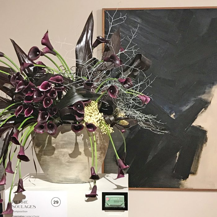
Jill Tortorella Pottery drew from Pierre Soulages’ Composition. The dark color and texture in the arrangement is perfectly matched to the feel in the painting. There are similarities in the seemingly random directions of the leaves as well as the brushstrokes. There is a hint of white that acts as a resting place for the eyes, similar to the light break in the painting. It feels like controlled chaos.
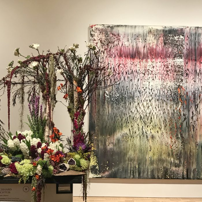
Lastly, Orange Pops take on Gerhard Richter’s Breath is a thoughtful interpretation. The painting reminds me of falling rain. It feels like the paint is dripping down the canvas starting at the top in an intense complexity that relaxes as you near the bottom. The thick tree branches are perfectly placed to match the small moments of vertical rest on the right side of the painting. The floral choices match perfectly to the hues in the art. The intense pinkish color that carries the top, dripping down into purple and the calming yellowish green where your eyes finally rest toward the bottom. I appreciate the small touches of orange that could have been easily missed if you did not careful study the piece.
Let us know which pieces were your favorites from Art in Bloom 2019.
— — —

Kristin Resch
Posted in: Inspiration Destination | Recreational
Tagged: art | art in bloom | Donald Judd | floral | Gerhard Richter | inspiration | inspiration destination | Kristin Resch | Milwaukee | milwaukee art museum | Nicolas De Stael | Pierre Soulages